Matte pastel: faded blacks and soft colour for family work
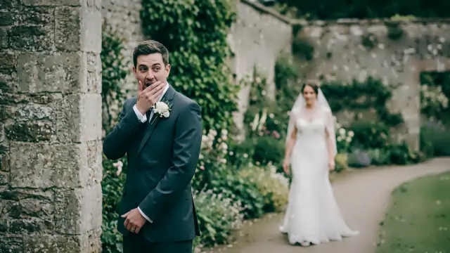
Faded blacks, clean bright whites and gentle pastel colour at low contrast, with creamy warm shadows and a faint blush in the highlights.
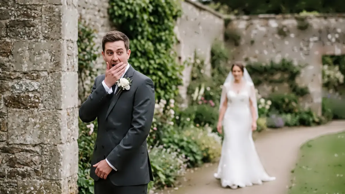
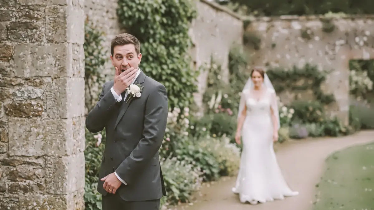 True to cameraMatte pastel
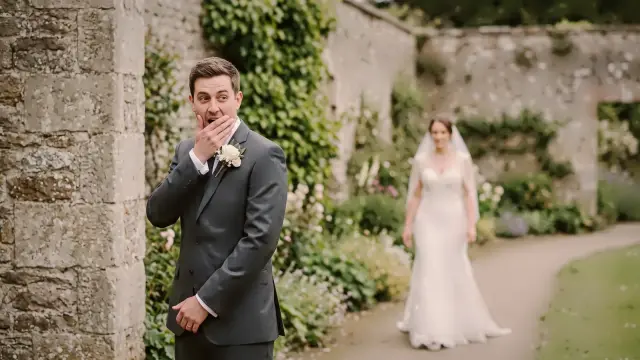
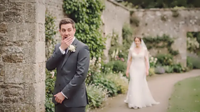
Drag to compare. Left of the line is True to camera, the plainest look; right of it is Matte pastel at full strength, rendered from the same file.
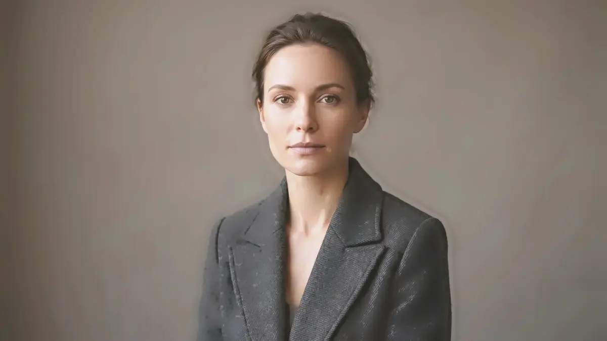
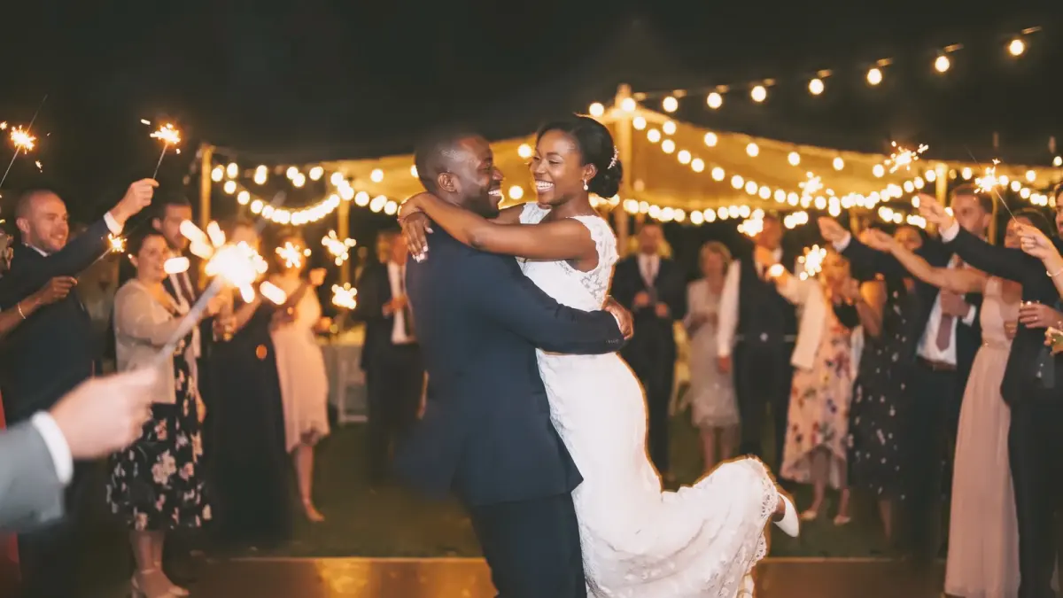
| What it does | Faded blacks, clean bright whites, low contrast, creamy shadows, gentle pastel colour |
|---|---|
| Good for | Maternity, family sessions, pastel decor |
When we'd reach for it
Maternity and family sessions, nurseries, pastel decor and soft spring light.
When we wouldn't
Anything that should feel bold: a sangeet dance floor, a stadium, a red-carpet arrival.
The recipe
These are the settings stored in the look, drawn rather than listed. They sit on top of your camera's own colour and the exposure and white balance CullTone sets for each photo, so the same look lands a little differently on every frame.
Every look has a strength from 0 to 1.5. At 0 you get the plain camera-matched edit, at 1 the look as drawn here, and above 1 more of everything it does. More on reading curves in tone curves for photographers.
Close to this one
Try Matte pastel on your own photos
Start a trial, create a project and pick this look. The studio shows it on your frames, at any strength, before anything renders.